Typography
Considered use of typography can present content clearly and more efficiently for every user. In Kuali's case, we universally uses the Roboto font family, available under an Apache 2.0 license at Google Fonts.
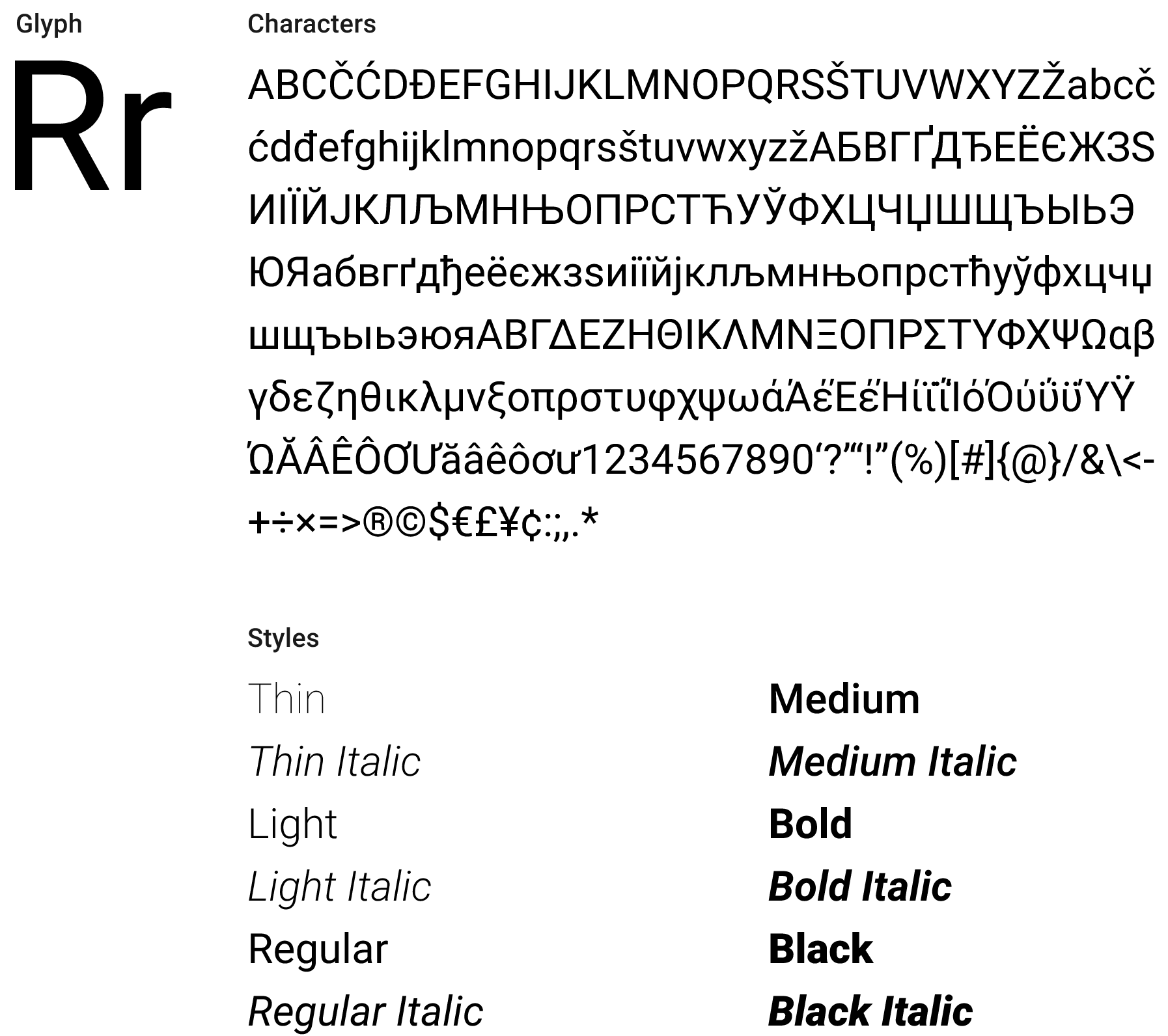
Roboto has a dual nature. It has a mechanical skeleton and the forms are largely geometric. At the same time, the font features friendly and open curves. While some grotesks distort their letterforms to force a rigid rhythm, Roboto doesn’t compromise, allowing letters to be settled into their natural width. This makes for a more natural reading rhythm more commonly found in humanist and serif types.
Adding Roboto to Your Project
Including Roboto in your project can be done in one of two ways, with us generally preferring the first to avoid CSP and/or CDN issues. We recommend including the following weights and variants to your project; variants marked in asterisk are required inclusions, but you may omit others depending on your needs:
- Thin 100
- Light 300
- Regular 400*
- Regular 400 Italic*
- Medium 500*
- Medium 500 Italic*
- Bold 700*
- Bold 700 Italic*
- Black 900
To include Roboto in your project, include these lines of HTML in the <head> of your document:
<link rel="preconnect" href="https://fonts.gstatic.com" /><linkhref="https://fonts.googleapis.com/css2?family=Roboto:ital,wght@0,100;0,300;0,400;0,500;0,700;0,900;1,400;1,500;1,700&display=swap"rel="stylesheet"/>
Note that you can choose to include specific weights and variants by adjusting the semicolon-separated aspects of the URL.
Standard Variants & Type Scale
This type scale is intended to serve as a starting point for the typography in our applications, and provides styles for core HTML elements. It is not intended to be exhaustive and we expect each team to define necessary styles outside of this scale for their applications.
The use of the specified Body 1 style for the base font in all applications is key to the compatibility of components working throughout the Kuali ecosystem of apps. Note that we have a 14px base font size, rather than the browser standard of 16px . In CSS, you can express this as html { font-size: 87.5%; }, and then use rem units to scale accordingly.
While our type scale only specifies the Regular and Medium styles to simplify, drive legibility and reduce font loading to Regular, Regular Italic, Medium and Medium Italic there may be situations where use of the other styles is appropriate. See Adding Roboto to Your Project for more details.
We display both hard pixel and rem units for these variants, but in a browser implementation, you should always use
remunits for accessibility purposes. Additionally, we use unitlessline-heightwhere possible to best scale with potential font size differences.
Type Scale Table
| Style Name | Font Size (px/rem) | Line Height (px/unitless) | Font Weight | Letter Spacing (px/rem) |
|---|---|---|---|---|
| Body 1 | 14px/1rem | 20px/1.429 | 400 | 0 |
| H1 | 32px/2.29rem | 48px/1.5 | 400 | 0.25px/0.018rem |
| H2 | 24px/1.74rem | 36px/1.5 | 400 | 0 |
| H3 | 20px/1.43rem | 30px/1.5 | 500 | 0.15px/0.01rem |
| H4–6 | 16px/1.14rem | 24px/1.5 | 500 | 0.15px/0.01rem |
| Subtitle 1 | 16px/1.14rem | 24px/1.5 | 400 | 0.15px/0.01rem |
| Subtitle 2 | 14px/1rem | 20px/1.429 | 500 | 0.10px/0.007rem |
Caption/<small> | 12px/0.857rem | 16px/1.333 | 400 | 0.4px/0.0286rem |
| Small Caption | 9px/0.643rem | 12px/1.333 | 500 | 0.4px/0.0286rem |
Type Scale CSS
The following snippet uses the table styles above to provide core element styles for typography.
html {font-family: Roboto, -apple-system, BlinkMacSystemFont, 'Segoe UI', Helvetica,Arial, sans-serif;font-size: 87.5%; /** assuming a 16px browser base size, adjust to 14px */line-height: 1.429;}h1,h2,h3,h4,h5,h6 {font-weight: 500; /** will be overridden for some below */line-height: 1.5;}h1 {font-size: 2.29rem;}h2 {font-size: 1.74rem;}h3 {font-size: 1.43rem;}h4,h5,h6 {font-size: 1.14rem;}h1,h2 {font-weight: 400;}h1 {letter-spacing: 0.018rem;}h3,h4,h5,h6 {letter-spacing: 0.01rem;}.subtitle1 {font-size: 1.14rem;font-weight: 400;letter-spacing: 0.01rem;line-height: 1.5;}.subtitle2 {font-size: 1rem;font-weight: 500;letter-spacing: 0.007rem;line-height: 1.429;}small,.smaller {font-size: 0.857rem;font-weight: 500;letter-spacing: 0.0286rem;line-height: 1.333;}.smaller {font-size: 0.643rem;}
Other Typographic Elements
In addition to core headers and paragraph text, we offer other styles for miscellaneous elements.
Lists (ol /ul)
In long-form text blocks, lists should always be presented:
- With a list-item displayed
- With the list-item indicator flush-left with other paragraphs
- With subsequent lines of multiple-line list items indented to the point where text of the first line starts, past the list-item indicator
Combined, you can use the following CSS to get lists going on your page:
ul, ol {list-style-position: outside;margin-left: 0;padding-left: 1.25rem;}
Code Display (code )
Code blocks should use the browser's default implementation, and are the one exception to our use of the Roboto font family in webpages. No special CSS is needed for these tags.
<pre><code>console.log('Hello world!');</code></pre>
Field Rows & Form Inputs
Form inputs have special considerations to take into account. Although both inputs and labels should still use the Roboto font family, labels must be styled to differentiate from normal text. A sample of how one might do this is provided below:
label {/** @extend .subtitle2; */ /** if you use SCSS or similar */font-size: 1rem;font-weight: 500;letter-spacing: 0.007rem;line-height: 1.429;}
Typographic Colors & Accessibility Guidelines
Our supported text style colors include the following primary variants; see the Colors Rudiment for more details:
- Primary:
#111111 - Secondary:
#666666 - Link:
#0066cc - White:
#ffffff
When using colored text in your app, always strive to meet WCAG 2.1 AA standards for color contrast between elements. Your text must have, at minimum, a 3:1 contrast ratio for text larger than 18pt (h1 –h3 ), and 4.5:1 contrast for text smaller than 18pt (everything else).
Print Styles
Although our typography guidelines largely apply to websites and apps viewed on the screen, many Kuali modules utilize print functionality. All Kuali apps should also include a print stylesheet that addresses typographic concerns, with one simple set of CSS styles being provided below.
@page {margin: 52px;}h1,h2,h3,h4,h5,h6 {break-after: avoid-page;}p,li,code {orphans: 2;widows: 2;}